UI/UX CASE STUDY
UI/UX CASE STUDY
A Modernized Version of the LA Fitness App
Overview
LA Fitness is a renowned fitness club chain that serves customers across the United States and Canada. Recent market research reveals that LA Fitness boasts an impressive network of over 700 locations throughout both countries, establishing itself as one of the largest fitness club chains in North America. Recognized for its extensively skilled personnel, LA Fitness offers a variety of enjoyable and effective workout choices suitable for individuals of all ages and diverse interests within families.
Role: Product Design (UX/UI)
Timeline: 4 weeks/ April 2023/ 60 hours
Tools Used: Figma, Adobe Illustrator, Adobe Photoshop
Goals & Questions
-
How can I simplify and optimize the app’s interface to make it more intuitive for users?
What steps can be taken to create a seamless and user-friendly experience within the app?
How can I update the app’s visual elements to achieve a modern and clean design that aligns with LA Fitness’ visual identity?
-
What strategies can be implemented to deliver a personalized and tailored experience to each user within the app?
In what ways can I customize the app to align with the unique preferences and needs of each user?
-
What measures can be taken to boost community and social engagement through the app?
How can I create opportunities for users to interact, share, and connect with each other within the app’s ecosystem?
THE PROCESS
EMPATHIZE
•
Define
•
Ideate
•
Prototype
•
Test
•
EMPATHIZE • Define • Ideate • Prototype • Test •
In order to gain deeper insights into LA Fitness and the experience of its users, I employed a multi-faceted research approach. This involved conducting background research on the company, analyzing app reviews, studying a key competitor, and closely observing the interactions of fellow LA Fitness members with the app.
The primary goals of my research process were as follows:
Identify pain points, frustrations, wants, and the unmet needs of existing users
Discover modern design patterns in fitness applications that make users connected, engaged, and feel satisfied
Research Approach
Competitive Analysis

Positive Points of the Planet Fitness Application:
Modern and visually appealing user interface: The application boasts an attractive UI design with pleasant gradients, high-quality visuals, and clear section divisions, providing a modern and engaging experience.
Enhanced personalization: The Planet Fitness app goes the extra mile by offering sections for user motivation, goal setting, and fitness profiles. It also integrates with fitness trackers, allowing users to track all their fitness activities, both inside and outside the gym. This comprehensive approach makes it a convenient one-stop solution for users.
Intuitive features: The app includes a handy scanner feature that can scan QR codes on Planet Fitness workout machines. This functionality leads users to video tutorials on how to properly operate each machine, ensuring they get the most out of their workouts. Additionally, the app provides information on the busiest times at the gym, assisting users in planning their visits more effectively.
Planet Fitness Application Ratings & Reviews
3.6 stars out of 5; 11K ratings
Negative Points of the Planet Fitness Application:
Membership card access: Similar to LA Fitness, the Planet Fitness app requires multiple clicks to display the membership pass for entry. This process could be more streamlined to enhance user convenience.
Excessive advertisements: The homepage navigation within the app contains an overload of advertisements, which can be distracting for users. Minimizing the number of ads or finding a more balanced approach would improve the overall user experience.
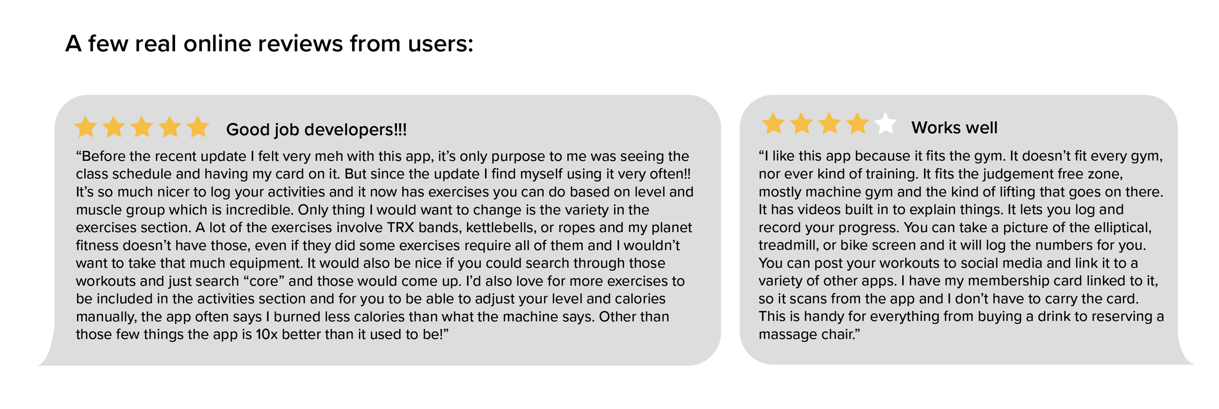
User Research
To identify the main challenges faced by users of the app, I thoroughly examined the store rating and read numerous comments. Furthermore, I closely observed the app’s interactions with five users, aiming to gain valuable insights into the user experience. Drawing from these findings and my own personal experience, I have identified several crucial areas that require attention and improvement.
Key Insights:
Users want a simpler, quicker, and more intuitive method to access their membership card and navigate through the app.
Most users prefer a more modern, clean, and visually appealing user interface that enhances their overall experience and enjoyment while interacting with the app.
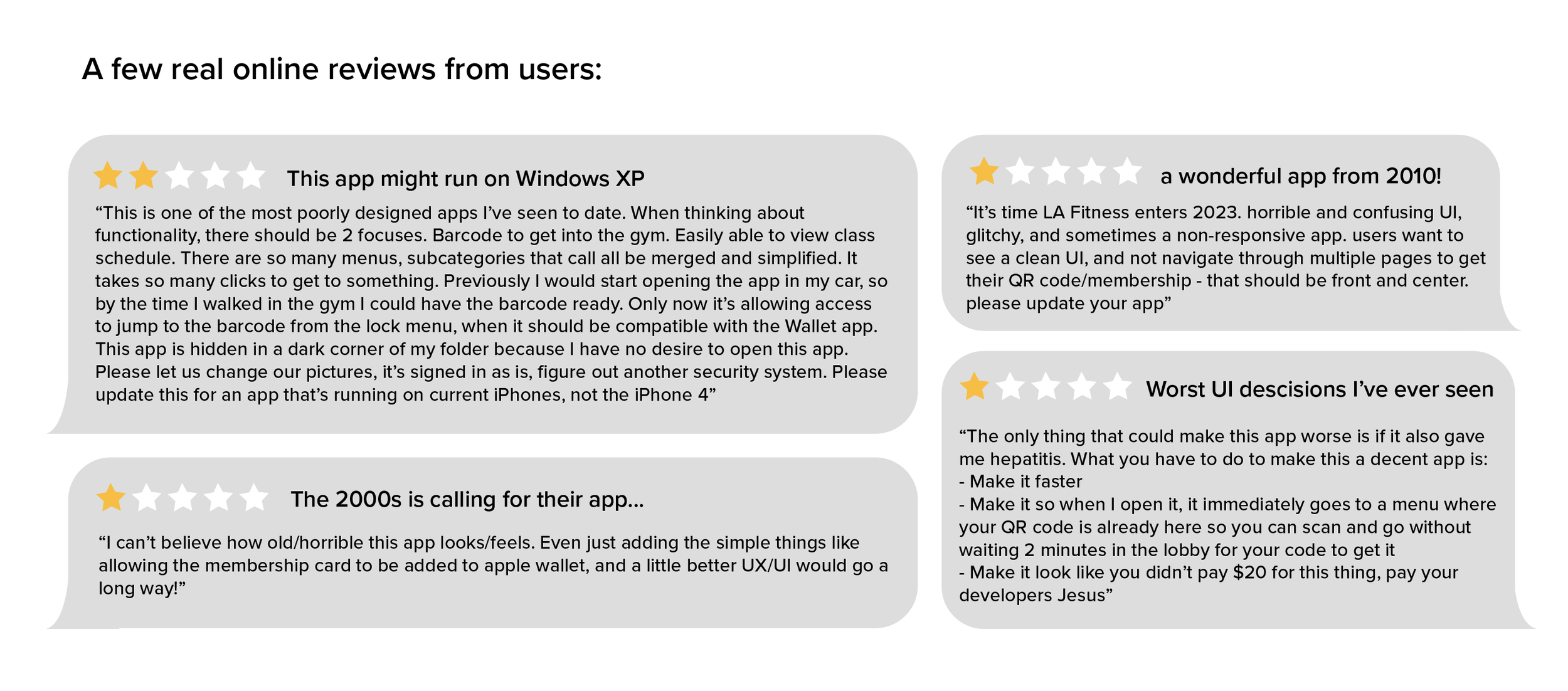
LA Fitness Application Ratings & Reviews
2.2 stars out of 5; 3.6K ratings
Empathize
•
DEFINE
•
Ideate
•
Prototype
•
Test
•
Empathize • DEFINE • Ideate • Prototype • Test •
Empathy Mapping

Key Insights:
The primary functions of the LA Fitness app that users frequently utilize are accessing their membership card, signing up for classes, and reserving courts. The additional capabilities and workout videos offered by the app are often overlooked or underutilized by most users.
Users commonly experience frustration when the app takes a significant amount of time to open the membership card feature, leading to a sense of inconvenience and impatience.
User Persona

Empathize
•
Define
•
IDEATE
•
Prototype
•
Test
•
Empathize • Define • IDEATE • Prototype • Test •
User Flow Mapping
After identifying the primary pain points encountered by users of the LA Fitness app, I mapped out and simplified the existing user flow. Below is an outline of the current application’s user flow, followed by an image showing the changes I made for the redesign.

To ensure a thorough understanding of the existing user flow and determine the optimal placement of new elements for improved efficiency, I first mapped out the user flow. By analyzing the current app’s user journey, I identified pain points and areas for enhancement. This user flow mapping provided valuable insights for subsequent steps such as sketching or wireframing, allowing for the strategic placement of new elements within the app. The mapping process was essential for creating a seamless and user-friendly redesign.

Empathize
•
Define
•
Ideate
•
PROTOTYPE
•
Test
•
Empathize • Define • Ideate • PROTOTYPE • Test •
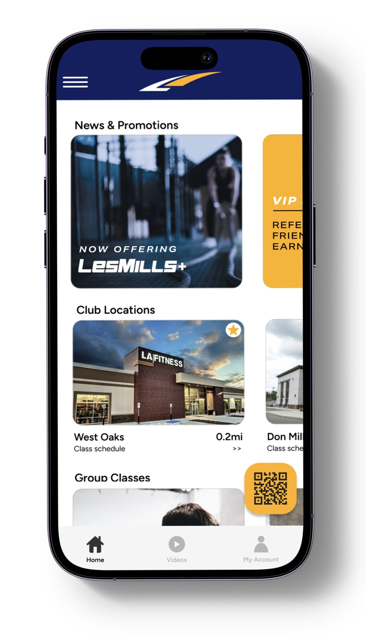
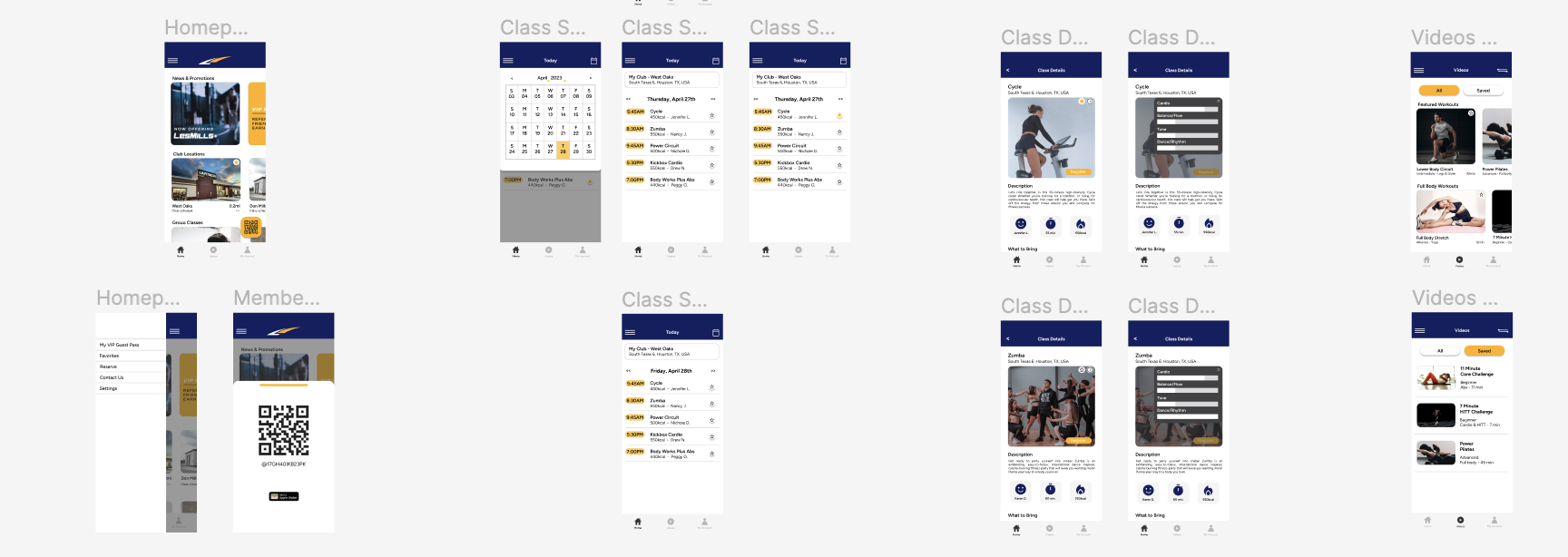
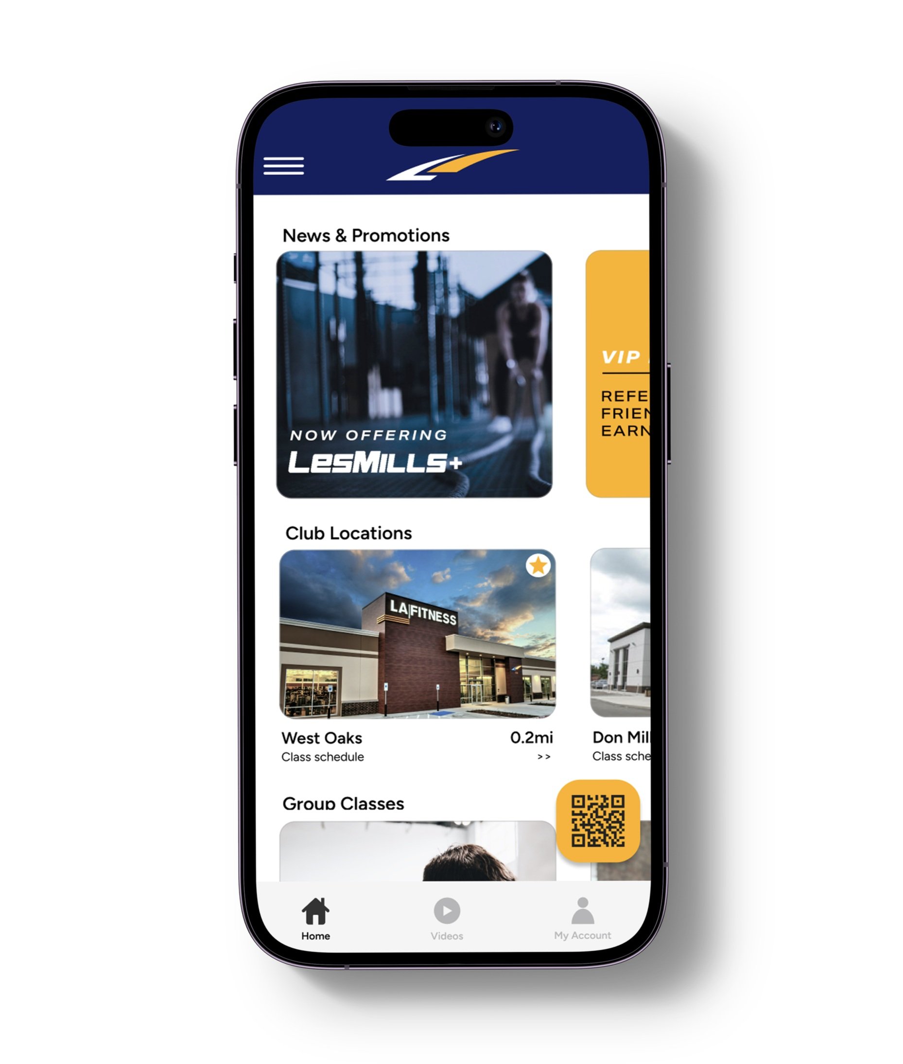
UI Kit & Wireframes

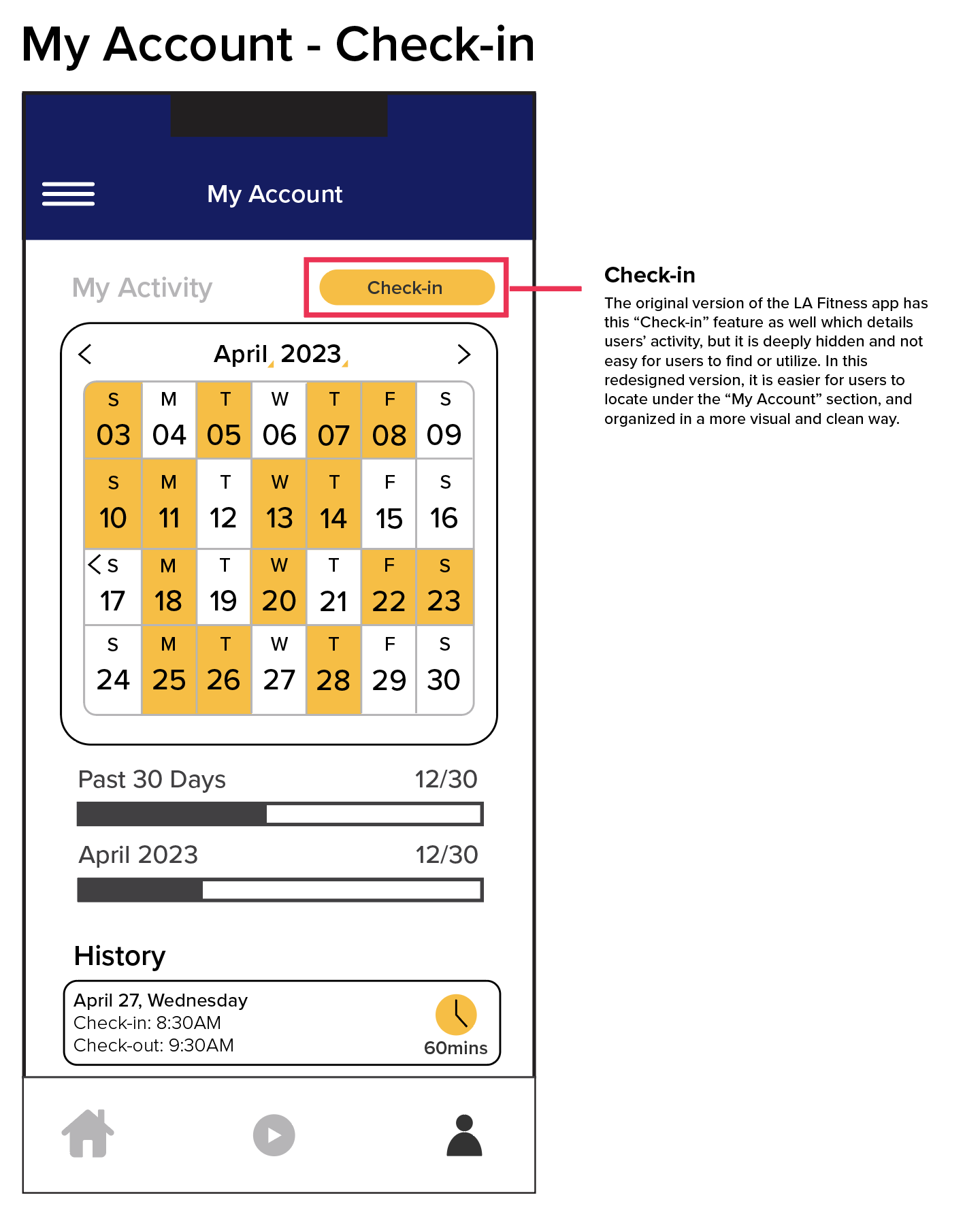

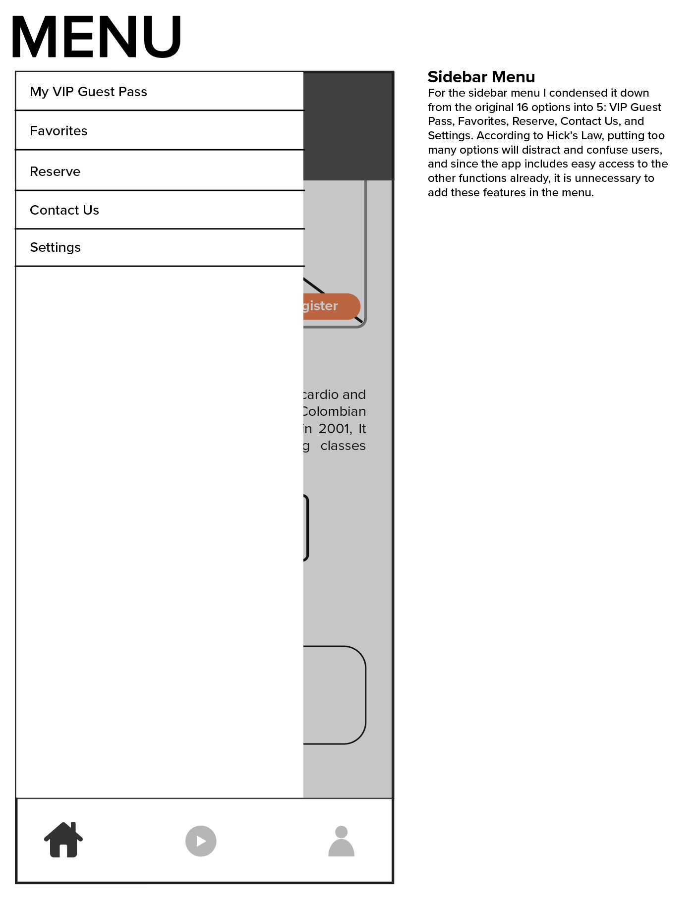


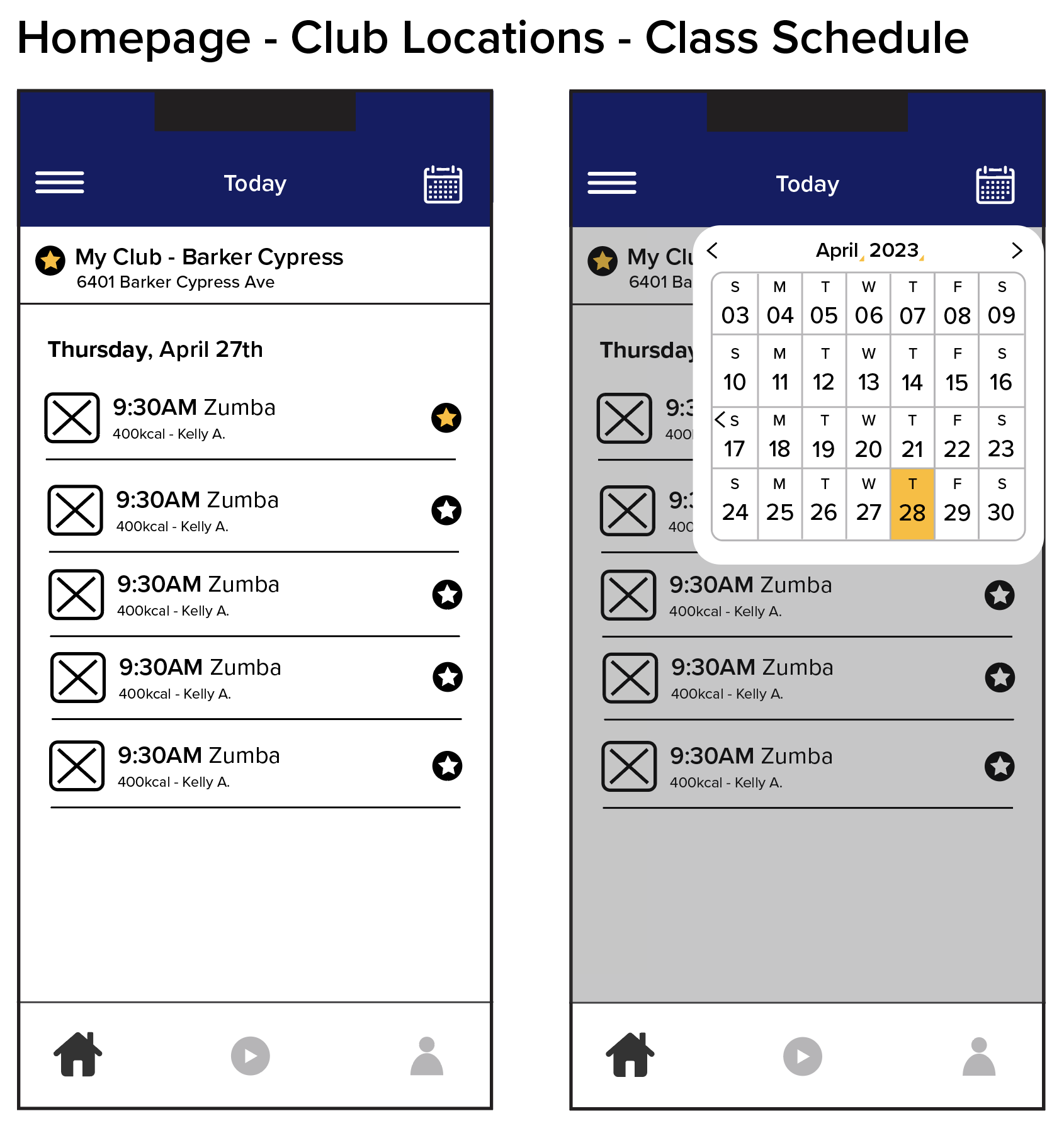

Mid-Fidelity Prototype
Once the wireframes were designed, I proceeded to develop the first prototype of the LA Fitness app redesign using Figma. By starting with the homepage and incorporating visual elements into the existing wireframes, I created a mid-fidelity prototype that closely resembles the final application. This prototype provides a more tangible and interactive representation of the end product, allowing for a better understanding of the app’s user experience and visual aesthetics.
Empathize
•
Define
•
Ideate
•
Prototype
•
TEST
•
Empathize • Define • Ideate • Prototype • TEST •
To enhance the mid-fidelity prototype, I conducted usability tests with users who screen-recorded their interactions and provided verbal feedback. This method proved highly effective in identifying critical gaps, highlighting areas for improvement, and evaluating the intuitiveness of the new design. By analyzing the recorded videos and feedback, I gained valuable insights to guide the app's final version.
Accessibility: In the initial iteration of the prototype, users encountered issues with the size, color, and placement of certain functions, making them difficult to access or read. This resulted in frustrating interactions instead of the intended ease of use. For example, while users appreciated the easily accessible membership card, they faced challenges when trying to close the page due to the thinness of the button.
Functionality of the prototype: Some transitions between different pages within the prototype were not as seamless as desired, indicating room for improvement. Enhancing these transitions will contribute to a more cohesive and smooth user experience.
Usability Test
Through an iterative process of incorporating user feedback into the prototype and conducting multiple rounds of testing, I arrived at the final version of the LA Fitness app redesign, which is now accessible on Figma.
Conclusion
Limitations
Throughout the project, it’s crucial to recognize the limitations that emerged and were considered during its development. One notable limitation is the absence of testing on a larger audience. Since the redesigned UI/UX of the application differs significantly from the previous version, it is challenging to accurately predict how users would react if introduced to it.
Reflections
The LA Fitness redesign project aimed to optimize the gym application that many people in the US use on a daily basis. The goal was to create a more enjoyable experience and encourage healthier habits. Throughout the process, I had the opportunity to apply UX design principles and gain practical knowledge, which allowed me to enhance an application that holds personal significance in my daily life.
Next Steps
The project reached its conclusion with the completion of the final prototype. If further work is to be pursued, the following steps could be considered:
Conduct more usability tests of the final prototype: Extend testing to a broader and more diverse audience of actual LA Fitness users to identify any additional areas for improvement.
Design Implementation & Handoff: Prepare design deliverables for handoff to developers and be available to address any follow-up questions or provide support as needed.
Maintenance: Stay responsive to future updates and revisions to ensure the LA Fitness app continues to meet user needs and remains effective.
By considering these next steps, the LA Fitness app redesign can continue to evolve and provide a more seamless and enjoyable experience for its users.