An Ethical Redesign of TikTok

Overview
TikTok is one of the most popular social media applications today, known for its highly addictive personalized algorithm. Through utilizing dark design patterns, designers contribute to this issue, exploiting their knowledge of psychology and design to use against users.
Role: Product Design (UX/UI)
Timeline: 6 weeks/ April & May 2022/ 120 hours
Tools Used: Figma, Adobe Illustrator, Adobe Photoshop, Google Forms, Google Sheets
Goals & Questions
-
How can I make users feel more in control when using the app?
-
What can I add to make users feel their time is respected?
How can I make users feel respected in terms of privacy?
How can I rebuild the trust that users have lost?
-
THE PROCESS
EMPATHIZE
•
Define
•
Ideate
•
Prototype
•
Test
•
EMPATHIZE • Define • Ideate • Prototype • Test •
I employed two different research methods to understand better the design of popular social media applications and their users — competitive analysis and user interviews.
For the competitive analysis, I looked at the current trending social media applications and examined the different features they employed to keep users engaged. The user interviews were conducted with 19 individuals, with the limitation of not having much diversity between them, as they mainly consisted of younger college-age students.
The goals for my research process were the following:
Discover design patterns users are accustomed to and keep them actively engaged on competitors’ applications.
Identify pain points and unmet needs for existing users.
Research Approach
Competitive Analysis

User Interviews
I used Google Forms to ask questions and collect quantitative and qualitative data from users for the interviews. Furthermore, I conducted in-person interviews and observed the way users interact with the existing model of TikTok to collect data on their patterns and more intricate thoughts on the platform.

Through conducting the survey, I concluded that a majority of users are drawn to TikTok’s uniquely accurate recommendation system, preferring to mostly watch content on the Homepage – For You, 84.2%. Individuals enjoy the new and interesting entertainment the application brings-making it one of their most preferred methods to pass time, with 73.7% of people surveyed using TikTok frequently, 31.6% almost every day, or consistently, 42.1%, defined as multiple times a day.

Insights:
Users want a way to better manage the time they spend on TikTok
Most users prefer to scroll through their For You feed, which utilizes an algorithm that learns from user behavior to present new and personalized content to keep them engaged
Empathize
•
DEFINE
•
Ideate
•
Prototype
•
Test
•
Empathize • DEFINE • Ideate • Prototype • Test •
Empathy Mapping

Insights:
Users enjoy TikTok for a multitude of reasons: for humor, entertainment, education, inspiration, and as a way to stay connected with others
Users often feel a sense of guilt when they spend more time on TikTok than expected
Trends on TikTok influence users with the products they choose to buy, the places they go, and the music they listen to

User Persona
Empathize
•
Define
•
IDEATE
•
Prototype
•
Test
•
Empathize • Define • IDEATE • Prototype • Test •
User Flow Mapping
After deciding and finalizing the new key features that I wanted to integrate, I mapped out the existing user flow of TikTok and then recreated it with the new elements added. The first image below shows an outline of the traditional actions users can take when interacting with the application, with the second image demonstrating the same flow except with the new key features integrated (the new components and their following branches are color coded for distinction.)

Before sketching or wireframing it was necessary to map out the user flow of the application, with and without the new features, in order to first make sense of how these new elements would be used, and where in the interface they should be added for the most efficiency.

Empathize
•
Define
•
Ideate
•
PROTOTYPE
•
Test
•
Empathize • Define • Ideate • PROTOTYPE • Test •
Wireframes
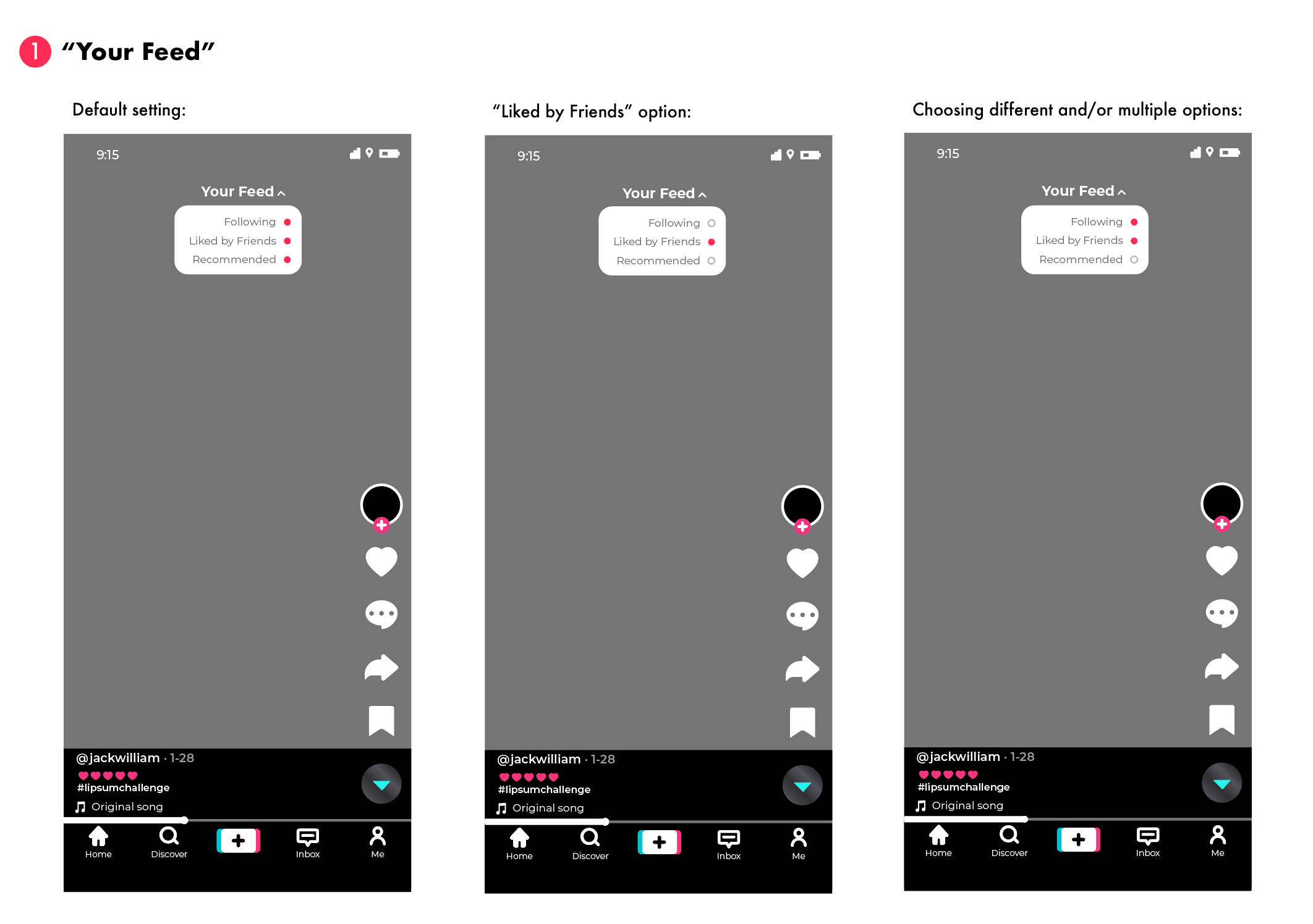

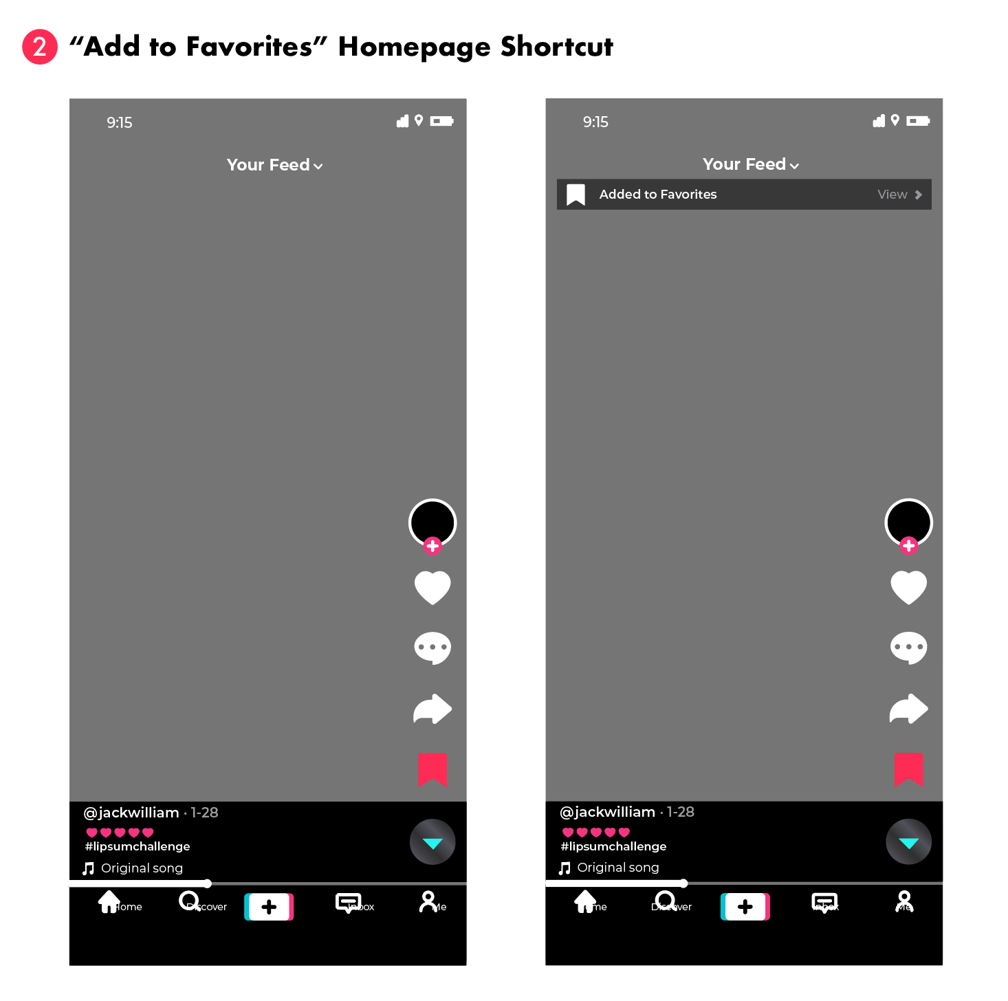


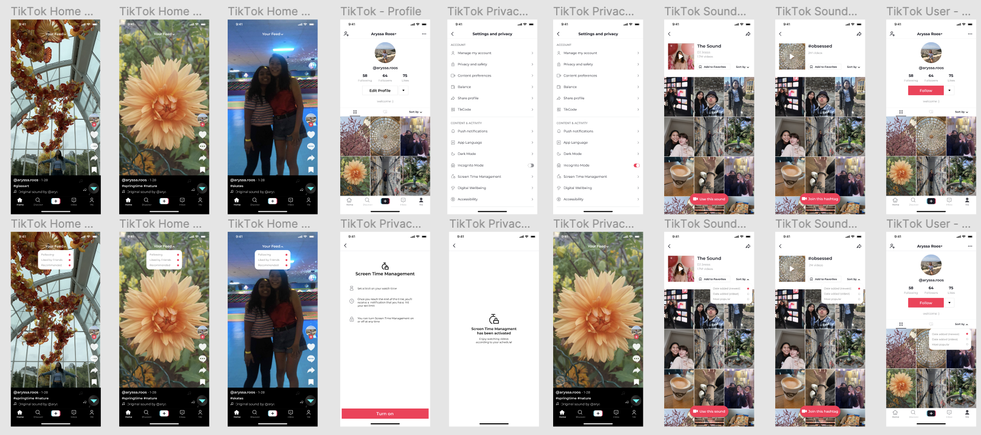
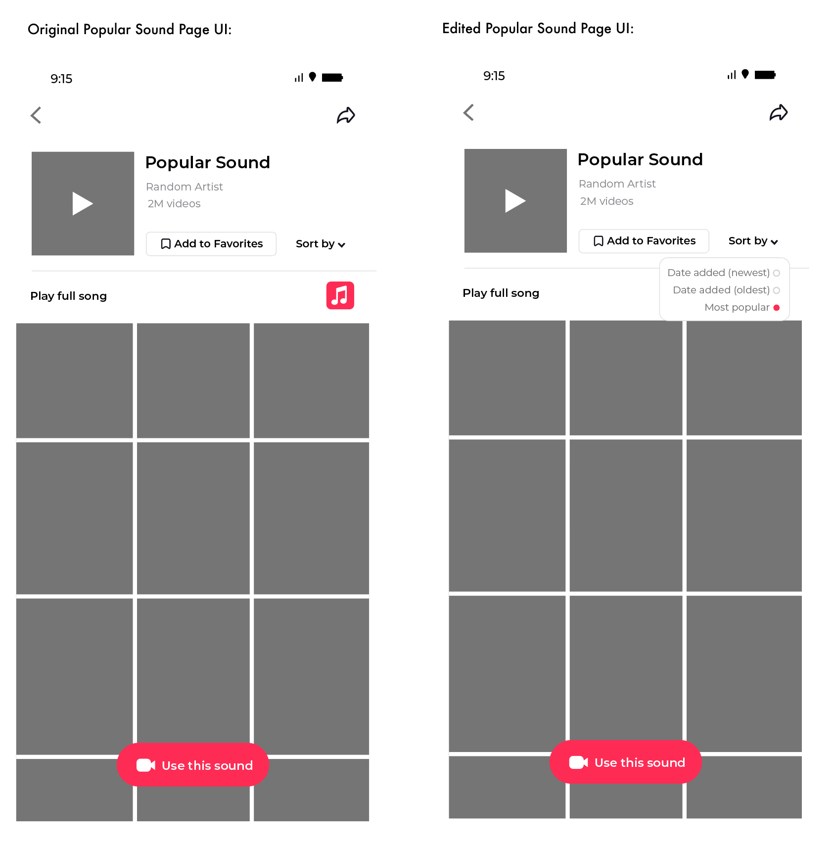
The “Sort By” option was developed after researching and observing the way users interacted with the app, looking at one of their pain points of spending too much time searching for a certain video on a profile, sound, or hashtag page. The new “Sort By” feature lets users organize the way in which content is presented on a page (from Date Added-newest, Date Added-oldest, or Most Popular), similar to the sorting method of videos on a creator’s Youtube channel, empowering them and reducing the time it takes to search for specific content.


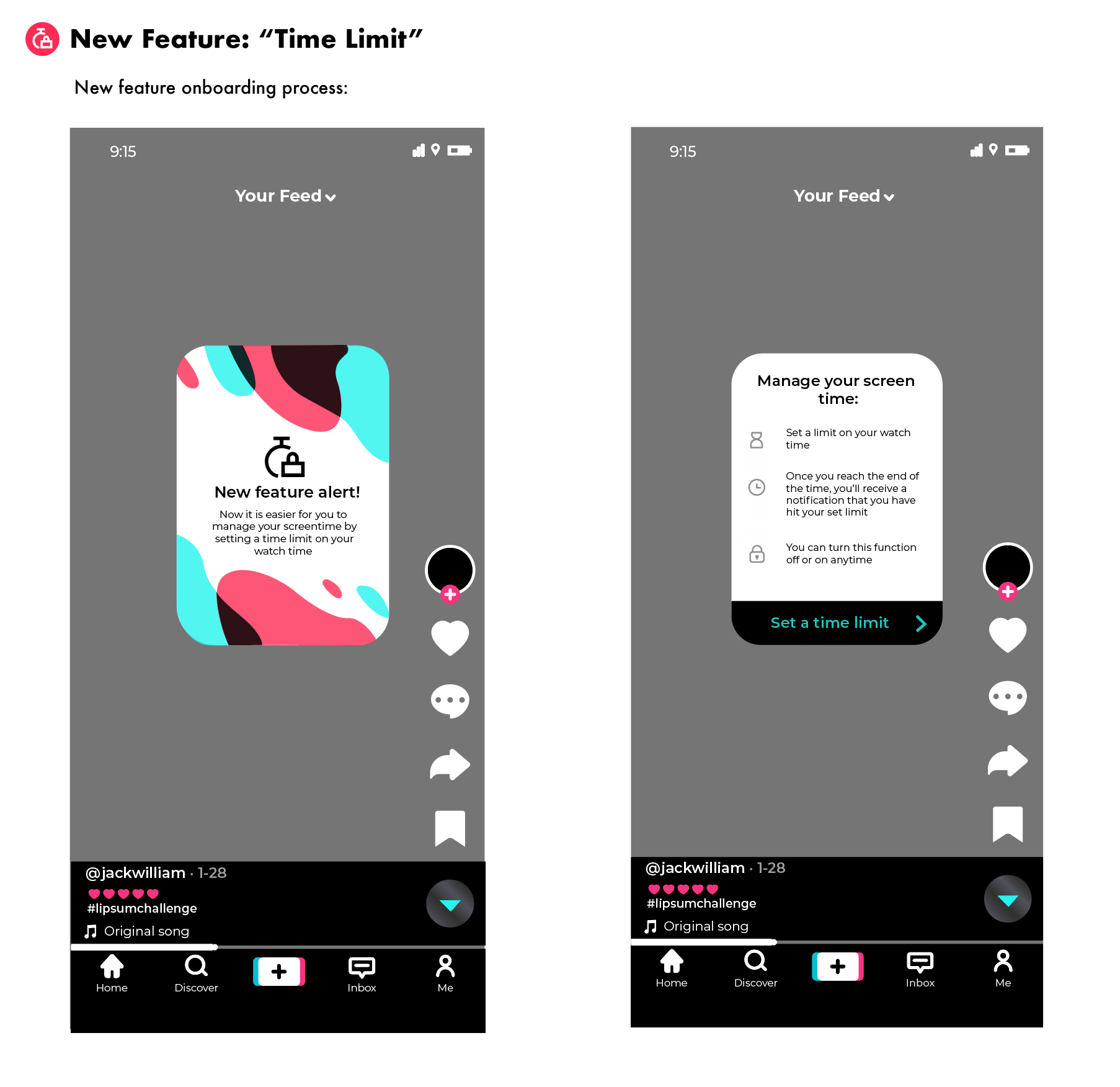
The new feature “Time Limit” was developed with the aim of reducing users’ screen time, promoting digital well-being, and respecting users’ time. Actually, when I was first developing this feature I learned that TikTok already had a similar feature that was labeled “Digital Well-Being” at the time, yet because it was hidden within the Settings and Privacy section I, and many other users, were unaware of its existence.
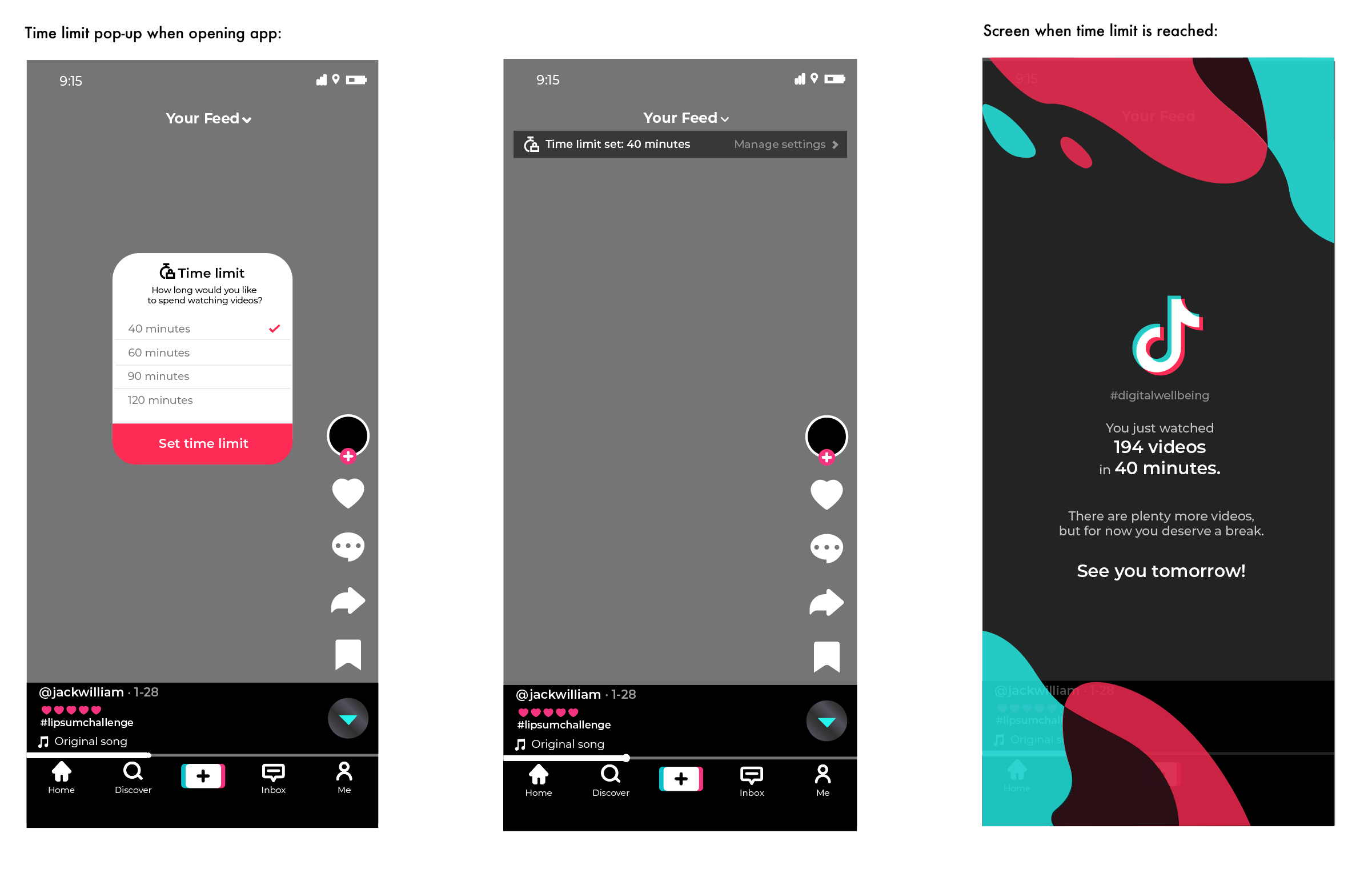
To combat this, I made the “Time Limit” feature have an official onboarding process to introduce the function to users and a pop-up that would appear each time the application was opened (which can be disabled in Settings and Privacy.) This was to ensure that users are not only aware of the feature’s existence, but also make sure they actively use it; each time they open TikTok users are able to set a designated amount of time they intend to spend on the app, with the app itself holding them accountable. When the time limit is up, instead of showing the previous video that TikTok used to display and was easy to swipe past and ignore, a full-screen page detailing numerical statistics of how many videos were watched, how long the user was on the app, and an empathetic message will pop up, forcing the user to then close the application.

Mid-Fidelity Prototype
Once all of the wireframes were created, I used the software Figma in order to make the first prototype of the redesigned TikTok. I began with creating the homepage and working from there, building the different wireframes that I already made but adding pictures to be able to better imagine real visual content, making the prototype seem more akin to the real application.
Empathize
•
Define
•
Ideate
•
Prototype
•
TEST
•
Empathize • Define • Ideate • Prototype • TEST •
Usability Test
To enhance my mid-fidelity prototype, I conducted a follow-up survey with the same participants, who screen-recorded themselves using it and shared their written feedback. This approach proved to be highly effective in pinpointing critical gaps, highlighting areas in need of improvement, and gauging user reactions to newly introduced features. By carefully analyzing the recorded videos and feedback, I was able to gain valuable insights into what changes were necessary for the final iteration.
Screen time management feature: Although I had included an option for users to decline to set a time limit within my original User Flow Chart, I had completely forgotten to add this option in the wireframes and prototype. This led to some users becoming a bit frustrated by being forced to undergo the process rather than empowering them with the choice.
The functionality of the prototype itself: Similar to the issue of the “Your Feed” filter, overall users had a very positive response to the new features added (although some users had a hard time discovering and utilizing them), but in many instances, they would have to press buttons multiple times or were a bit confused on how to accurately interact with the prototype (i.e. swipe up or tap.) The transitions between different pages were not super seamless or fluid and could be improved more. This could possibly be mitigated by making some of the aspects on the prototype a bit larger so they would be easier for users to press on or click.
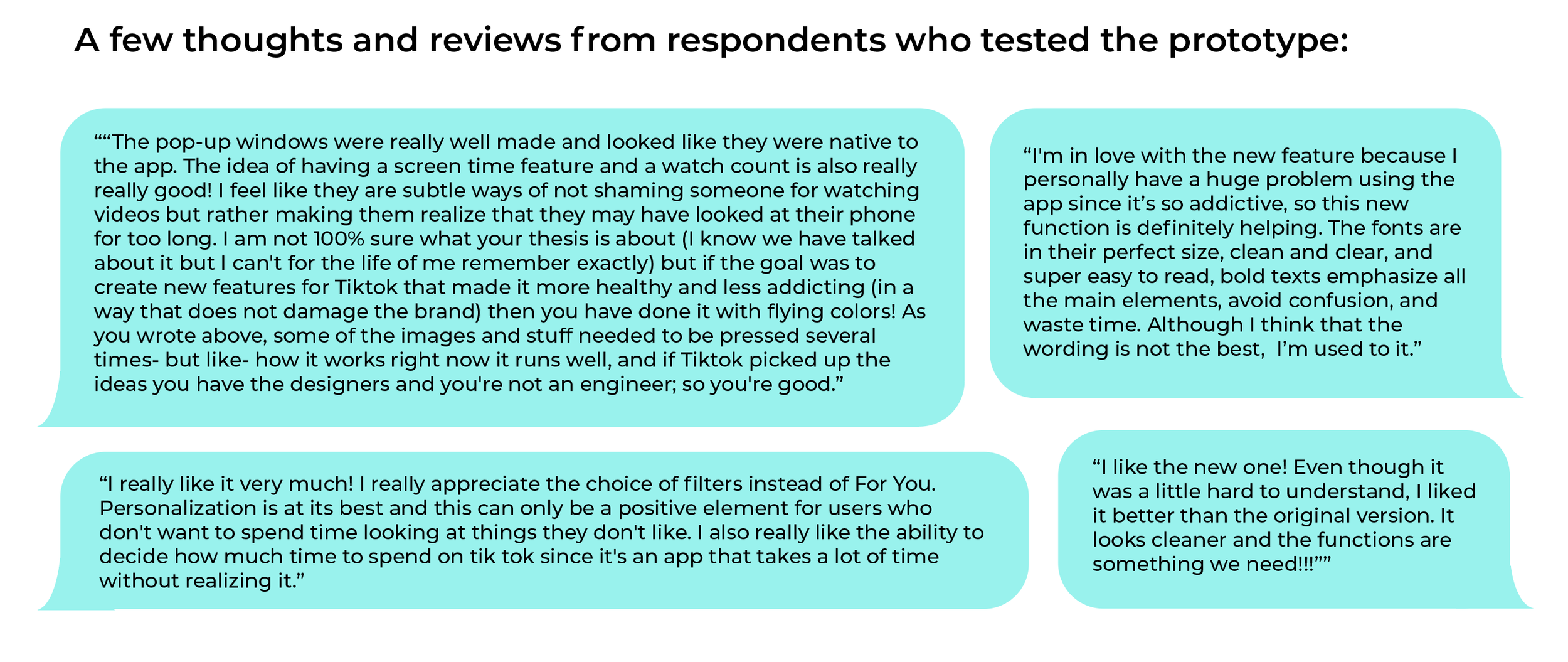
Based on the feedback, there could be an improvement in some of the copy that was written to label or describe certain elements (in regards to the “Your Feed,” “For You”, and “Following” titles.) Also, one of the main things I came to realize after receiving feedback was that without properly explaining or introducing the new features or edited changes, it was very difficult for users to conclude and be able to test what was different and how these new aspects work. This was most definitely my error in not providing enough background information when sending out the prototype to be tested but also highlighted that the new features I had added were not as clear or self-explanatory as I had initially thought.

For the final prototype, I edited it based on the user feedback and tested it a few more times to ensure that it worked smoothly. Only after numerous iterations was I able to come up with the final prototype, which is available through Figma, and focuses on the new features I added while still respecting the integrity of TikTok’s original UI.
Conclusion
Limitations
Like any other project, this one has limitations that were brought to light and considered throughout its creation. The most prevalent was the fact that this redesign project was not fully developed, or coded, with the true effectiveness of the newly designed algorithm and features being solely measured in theory, not reality.
Reflections
This TikTok redesign project was created with the goal to inspire other designers to have a more ethical approach when creating products, and to focus on empowering users with their designs. Overall, I was able to study and have a deeper understanding of UX in general, as well as how important it is that the products we use must be designed in a way that they add to our lives, not take away from it.
Next Steps
This project concluded after the creation of the final prototype. If it were to be continued, I would follow these new steps:
Conduct more usability tests of the final prototype: On a wider and more diverse audience to see if there are any other revisions that could be made.
Design Implementation & Handoff: Organize design deliverables for handoff to be sent to developers, and be prepared to assist with any follow-up questions.
Maintenance: Address any updates and revisions that come up in the future.